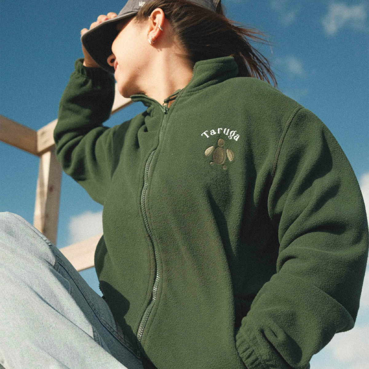
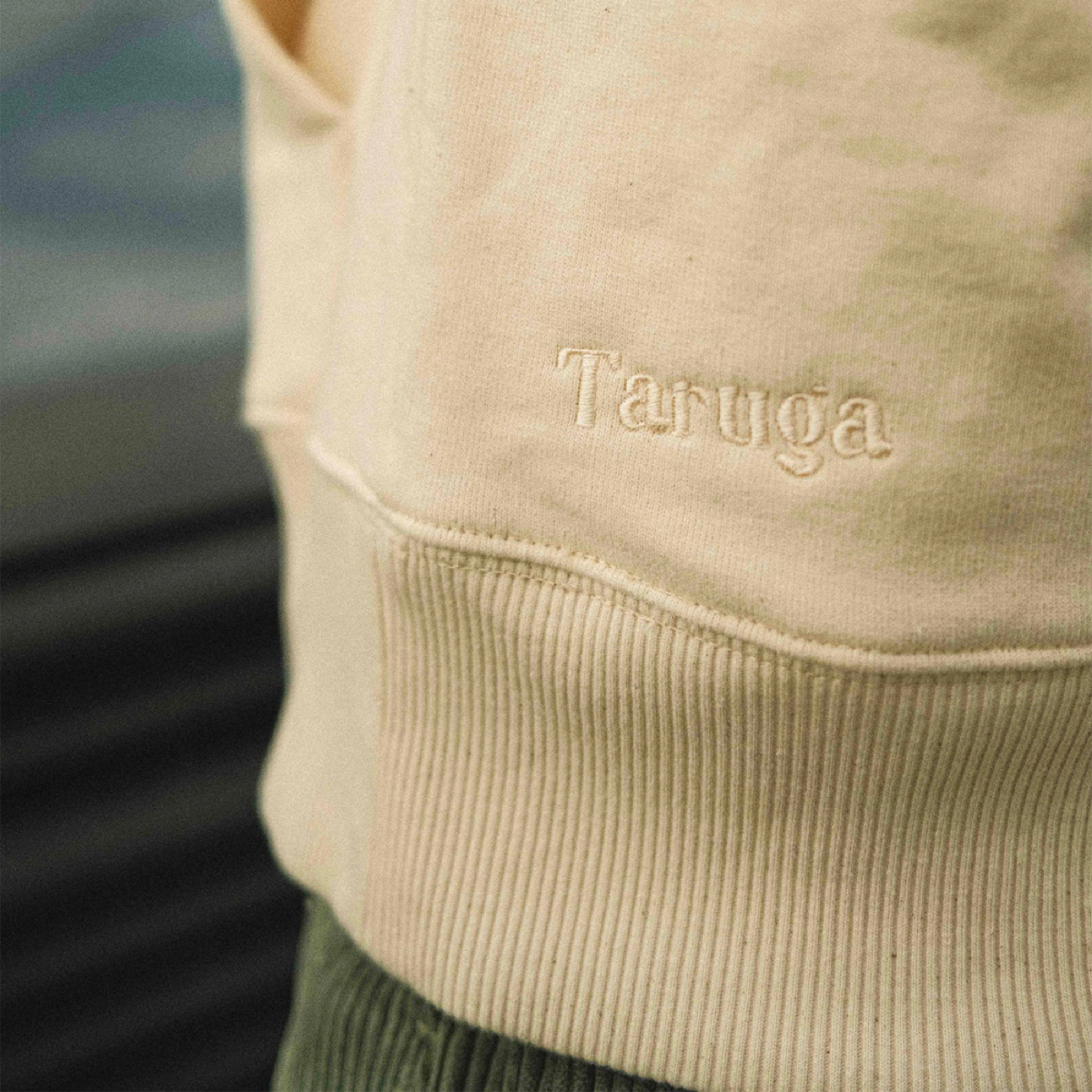
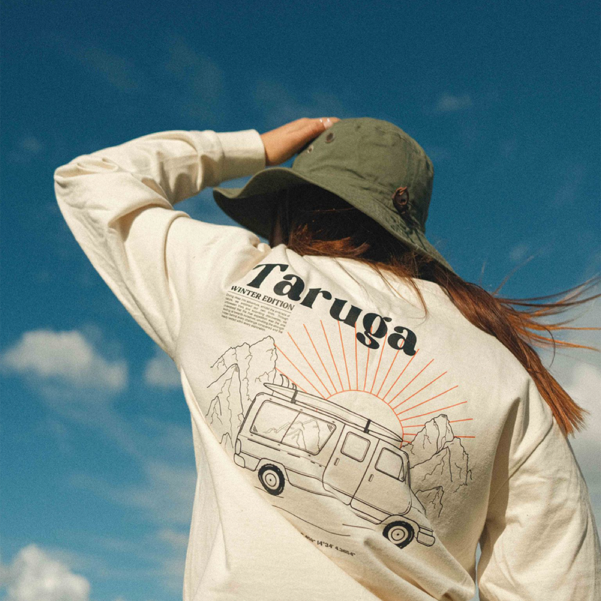
BRAND IDENTITY
Taruga isn’t just a clothing brand, it’s a companion for travelers on their adventures. Its visual identity is rooted in its logo, which derives from the Portuguese word « tartaruga », meaning turtle. Beyond that, Taruga is a meticulous exploration of typography, text, coordinates, and labels. But it doesn’t stop there ! Every illustration is carefully crafted to ensure that each color seamlessly integrates with its artwork, creating a harmonious visual experience that enhances the brand’s narrative of exploration and discovery.

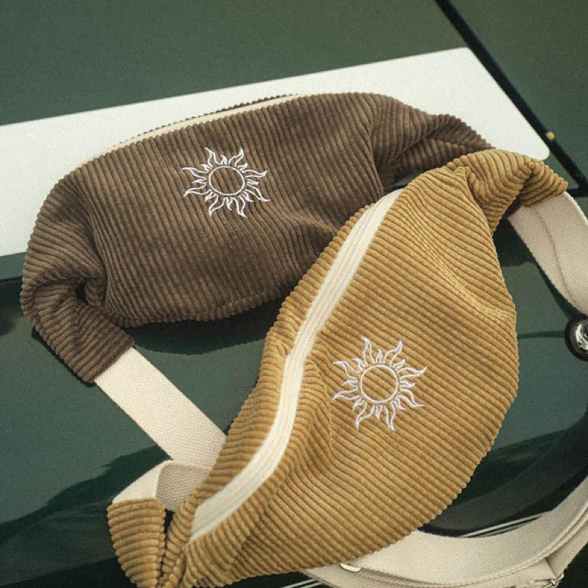
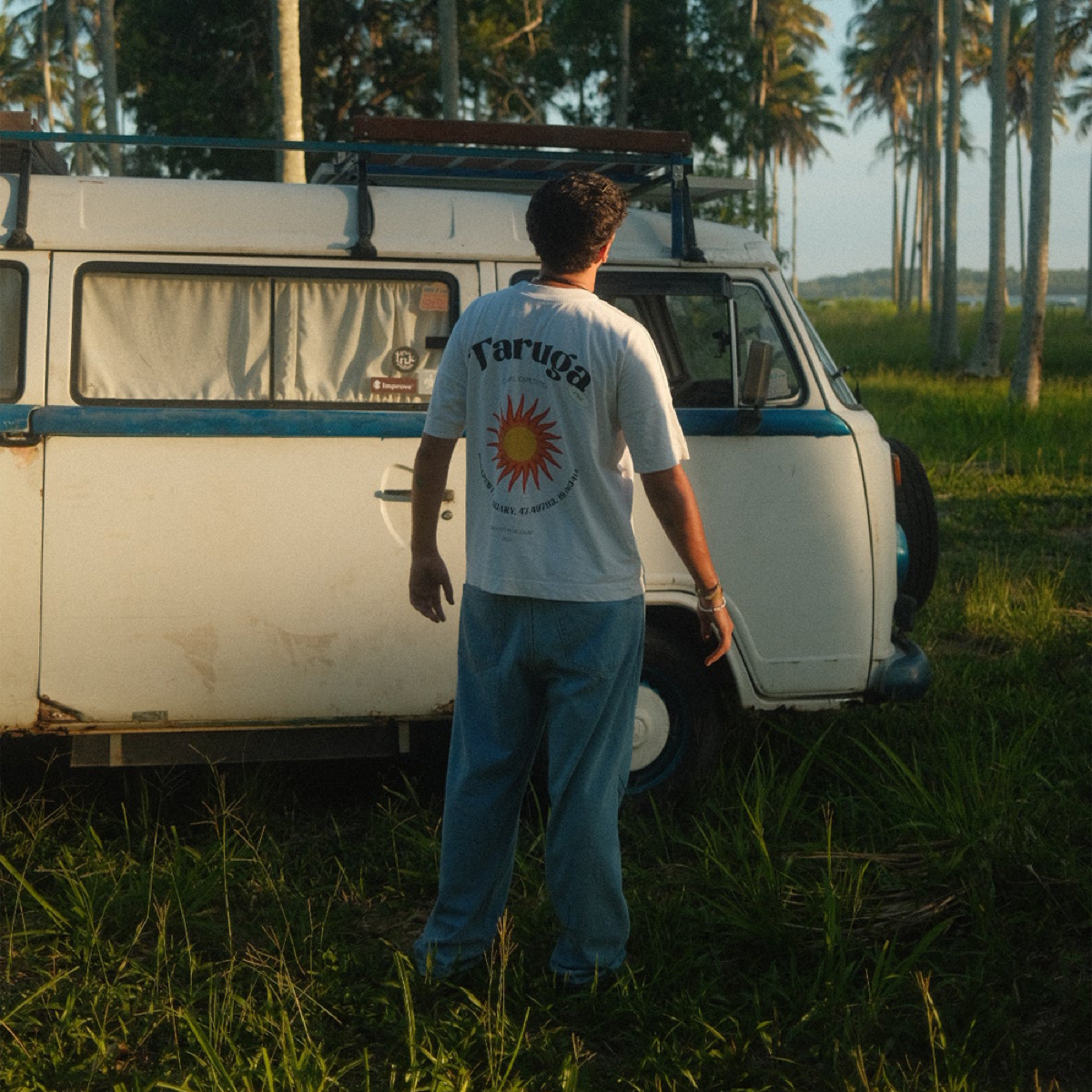
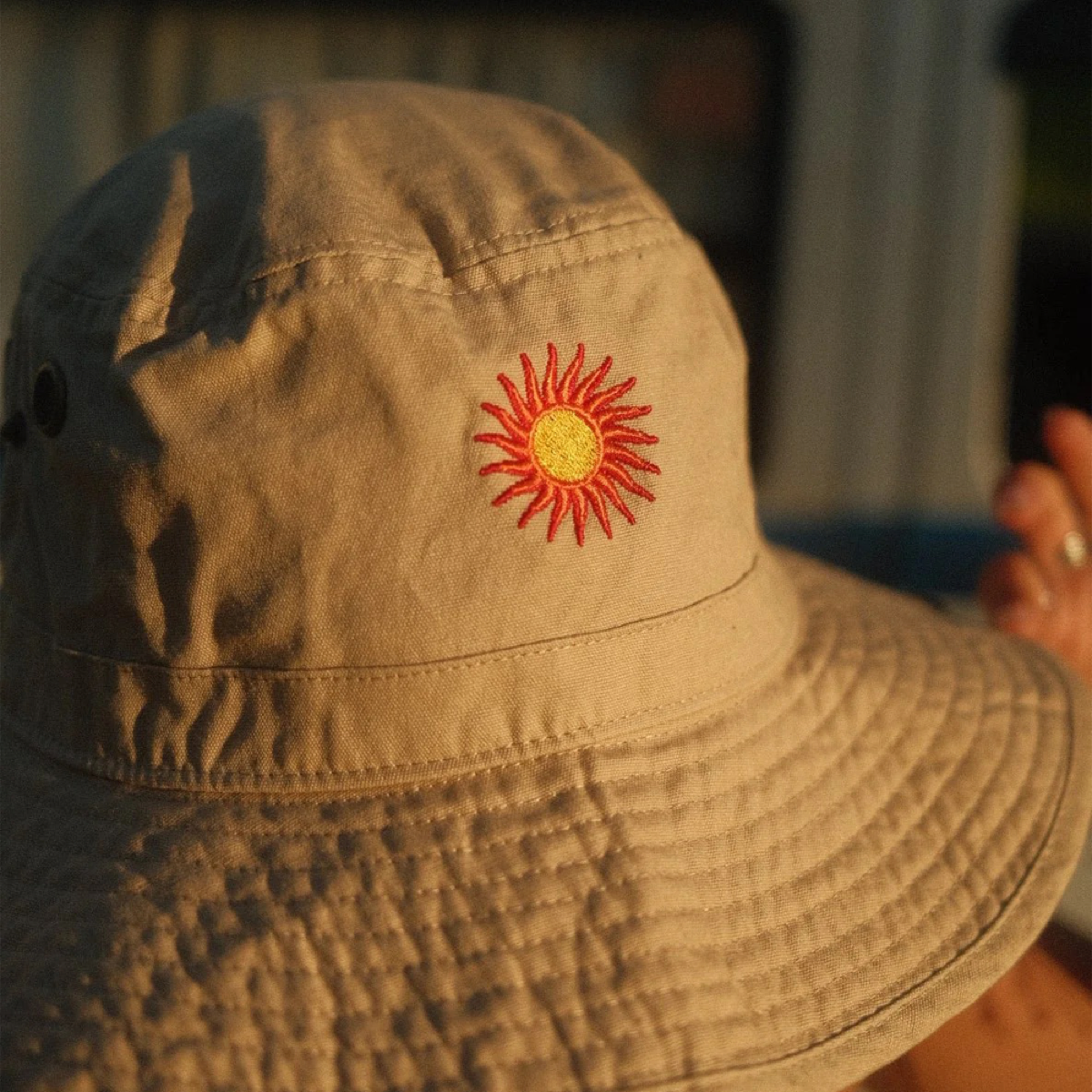


Some clothes


